Ocean Indicators Platform for Policy makers
Ocean By Data
UX & System Architecture
Overview
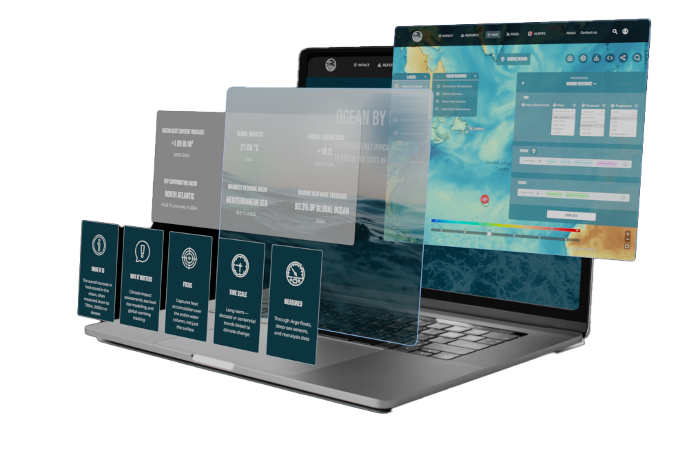
DESCRIPTION : I created a platform for translating complex ocean data into actionable insights for policy makers.
CHALLENGE : Bridging the gap between complex scientific data and fast policy decision-making : this project explores a shift toward LLM-powered conversational access to data, enabling faster understanding without requiring domain expertise.
APPROACH : The solution introduces a layered system combining structured data visualization with an LLM interaction layer : reports and maps act as interpreted outputs, while all insights remain traceable to original datasets.
NOTE : This project is a design demonstration. Some data has been modified or simplified to comply with NDA agreements, while preserving the structure and logic of the original platform.
CONTEXT
CHALLENGES
ROLE & CONTRIBUTION
CONTEXT
- ● Ocean data is fragmented across multiple platforms (Copernicus Marine Service, EMODnet, GOOS etc.), each with its own structure and logic.
- ● Existing platforms often prioritize data access over usability and clarity
- ● Diverse audience: policy-makers, scientists, NGOs, public
- ● Increasing need for ocean data in climate and policy decisions
CHALLENGES
- Data complexity : Scientific datasets are difficult to interpret without domain expertise
- Fragmentation : Indicators, formats, and visualizations vary across platforms, preventing consistent understanding
- Insights Speed : Users must navigate multiple interfaces and data sources to build a complete picture
- Clarity vs accuracy : Simplifying data risks losing scientific nuance, while preserving it increases complexity
ROLE & CONTRIBUTION
- ● Research & benchmarking of existing ocean data platforms to identify gaps in usability
- ● Information architecture and visualization strategy to move from high-level insights to detailed data exploration
- ● Interaction & visualization design: user flows, dashboards, and indicator views
KEY STAGES
1. Research & Structure
User needs and platform observations were used to define a structured approach to organizing and presenting ocean indicators.
Target Audience & User Requirements
Despite different goals, all users require clear interpretation of complex data.
Strategy & Analysis
The platforms reviewed provide high-quality and scientifically validated data.
The analysis focuses on how this data is structured and presented, rather than
the quality of the data itself.
01. Goals
- ● Simplify access to ocean indicators
- ● Enable comparison across datasets
- ● Improve readability of visualizations
- ● Prioritize interpretation over raw data
02. Benchmark
Comparative analysis:
Copernicus, NOAA, EMODnet, GOOS, OBIS, +10.
- → Indicator variety
- → Visualization methods
- → System usability
03. Insight
- - Complex ocean data requires gradual exploration
- - Users can approach the data from different entry points and levels of detail
- - A consistent structure supports understanding across indicators
1. A progressive approach to data exploration.
2. Dedicated flows (Policymakers / Analysts).
Customer journey map — policy maker perspective — 5 stages from awareness to action
To ground the strategy in real user experience, I mapped the policy maker's journey — and the pain points that emerged.
Information Architecture
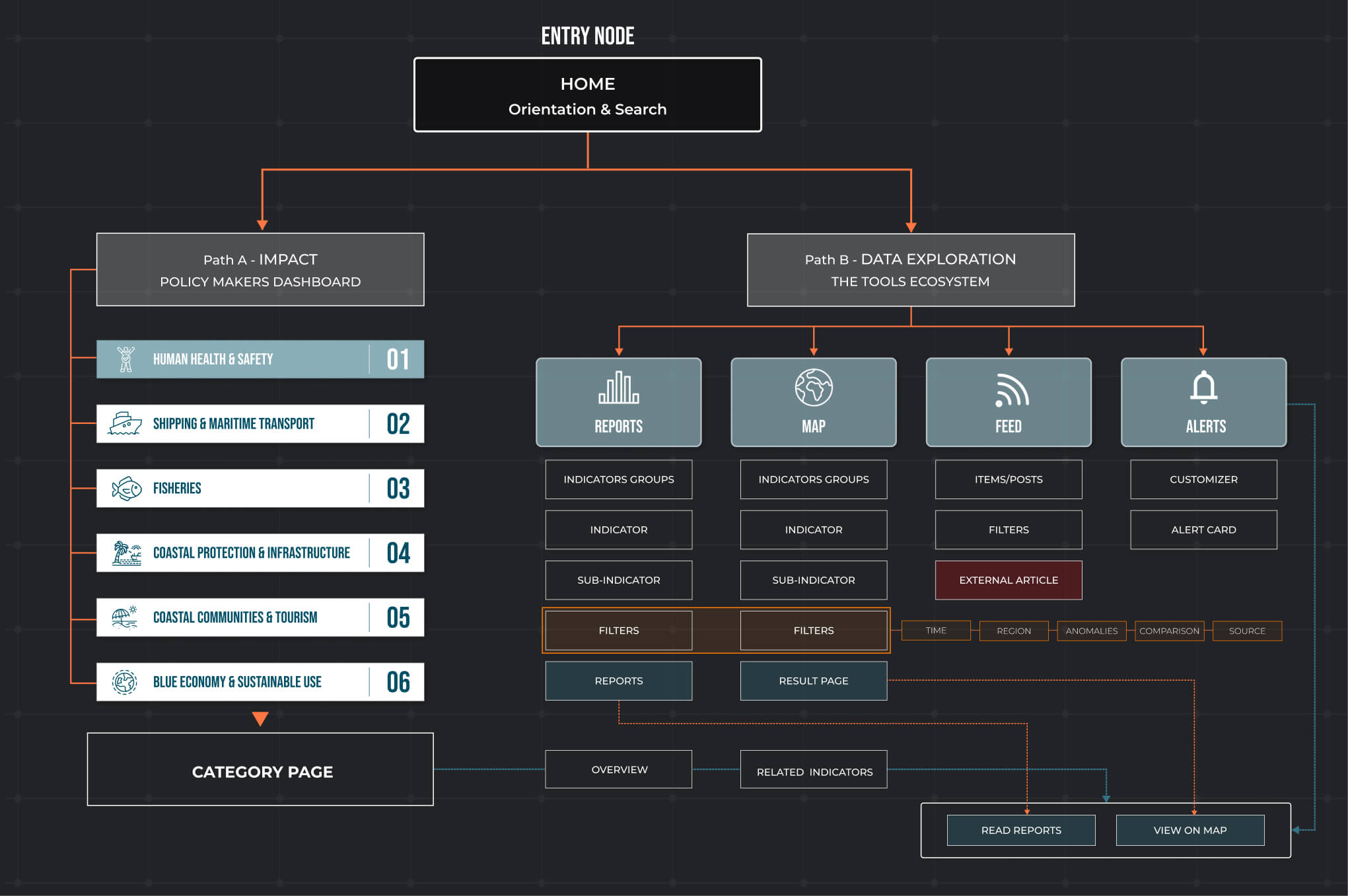
So the platform is divided into two primary entry points: a Policy Makers Section for high-level summaries and a Tools engine for deep data exploration.
From this point, the architecture branches into two specialized modules: Reports, which apply filters to generate a final Report, and Maps, which use a filtering layer to produce a Result Panel. Supplementary Feed and Alert modules provide real-time updates that interlink directly back to these core outputs.
Both pathways follow a unified functional hierarchy:
Indicator Groups
→
Indicators
→
Sub-indicators.
- ● Reports: Filtered data → Final Report
- ● Maps: Filtered data → Result Panel
Supplementary Feed and Alert modules provide real-time updates that interlink directly back to core outputs.
Two complementary ways of exploring the data
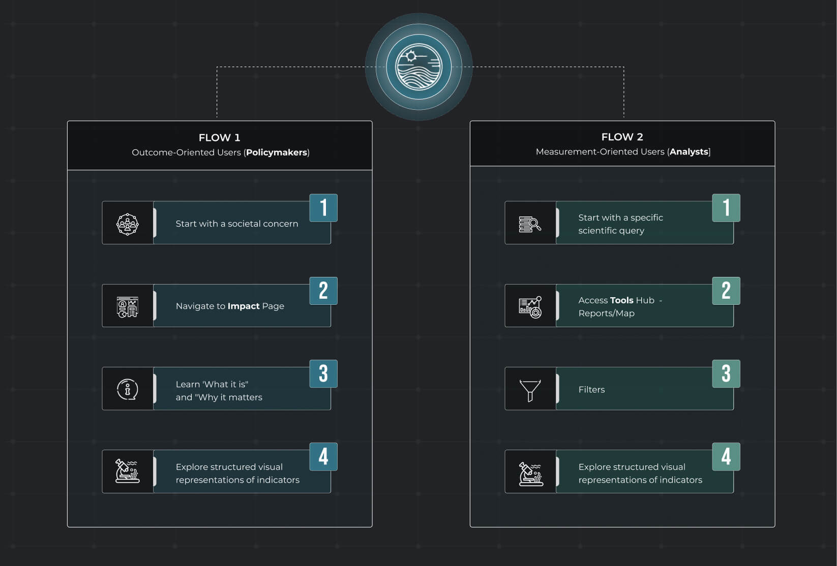
User Flow
2. Design System
I built a Design System that runs through the entire platform — when you're dealing with complex ocean data, the last thing users need is visual chaos.
The color palette is inspired by the ocean itself: Deep Ocean Blue (#004E64) anchors the interface as the primary brand color, supported by calm, readable neutrals and accents that guide attention without shouting over the data.
For typography, I went with Bebas Neue for display — it's bold, clean, and works perfectly for headlines and numbers that need to pop. For body text and labels, Montserrat keeps everything readable and approachable across all screen sizes.
The icon set was a project in itself. I created custom icons for key indicator categories/subcategories as Biology & Ecosystem, Anomalies, Salinity, Acidification etc. — so users can instantly recognize what they're looking at, even before reading the label.
These elements — along with some UI components you see below — form the foundation for every report, map, and data visualization in the platform: clear, consistent, and built to scale.
UI components
3. Data Visualization
The platform doesn't just show data — it generates visualizations on the fly. When a user asks a question, the LLM identifies the relevant indicators, retrieves the data, and selects the most appropriate chart type for that specific query. But the LLM doesn't decide how charts should look — that's where I came in.
I designed the full visual system: the chart types, the color logic, the layout principles, the interaction patterns. I defined what a bar chart looks like when it's showing regional comparisons, what a line chart needs to communicate temporal trends, what a map should highlight. The LLM assembles the data, but the visual language — that's mine. The result is consistent, readable, and coherent, no matter what question the user asks.
The examples shown below are illustrative — they demonstrate the chart types and visual patterns I designed. In production, every visualization pulls live data from official datasets (Copernicus, EMODnet, ICES, GOOS...), generated on demand by the LLM, but always rendered through the visual system I built.
FINAL DESIGN & DOCUMENTATION
The primary deliverable is a structured design and interaction specification defining the system's information architecture, interaction logic, and LLM-assisted data flows.
01. Platform Blueprint
A multi-layered ecosystem for ocean data implementing:
- ● Structured Visualization: Interactive maps and comprehensive reports.
- ● AI Intelligence: LLM-generated summaries and smart previews.
- ● Data Integrity: Fully traceable links to underlying datasets.
02. Documentation Scope
The technical and behavioral framework includes:
- - System-level information architecture and navigation logic.
- - Key interaction patterns for desktop and mobile contexts.
- - Behavioral rules for deep data exploration.
- - Logic for LLM-assisted output generation.
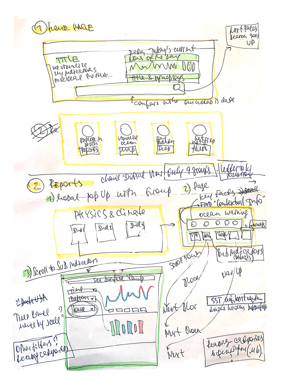
Interface sketches
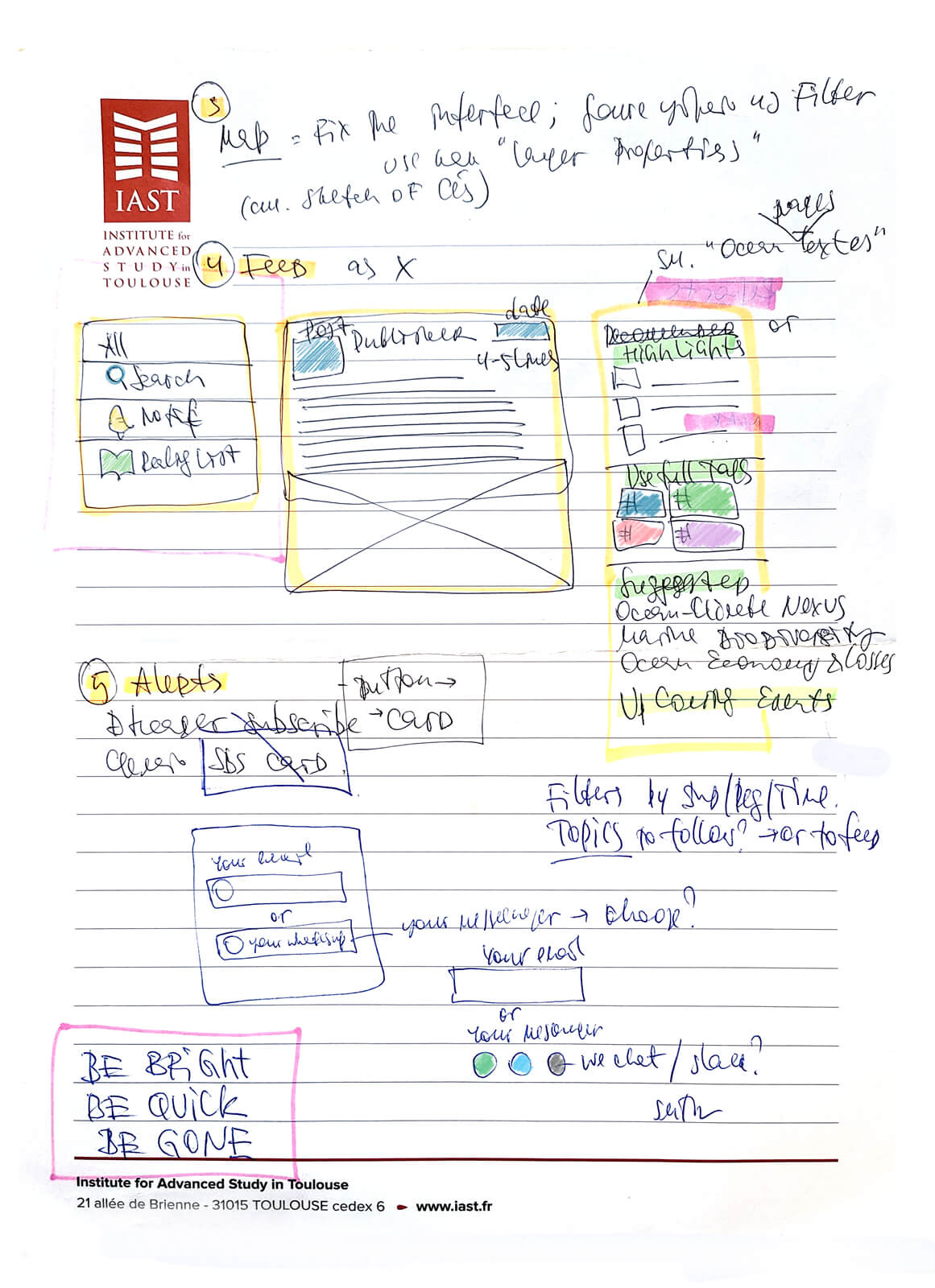
interface blocks
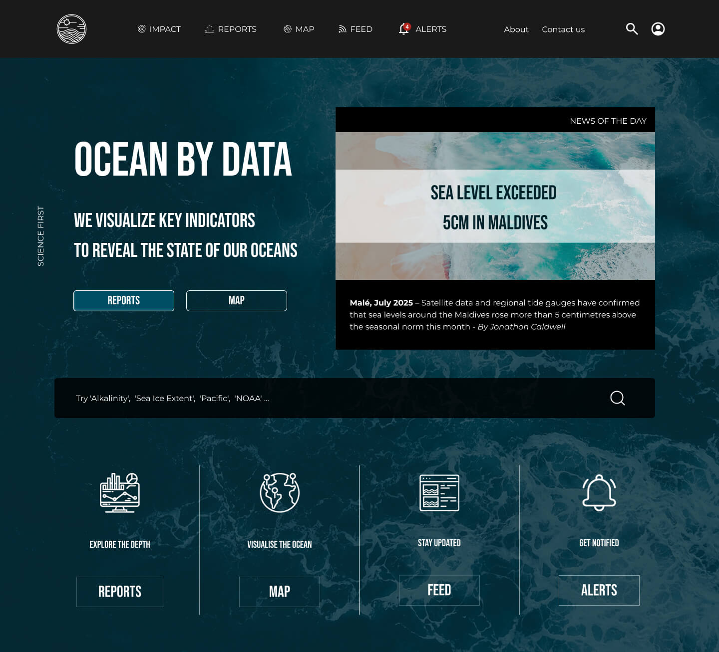
Hero
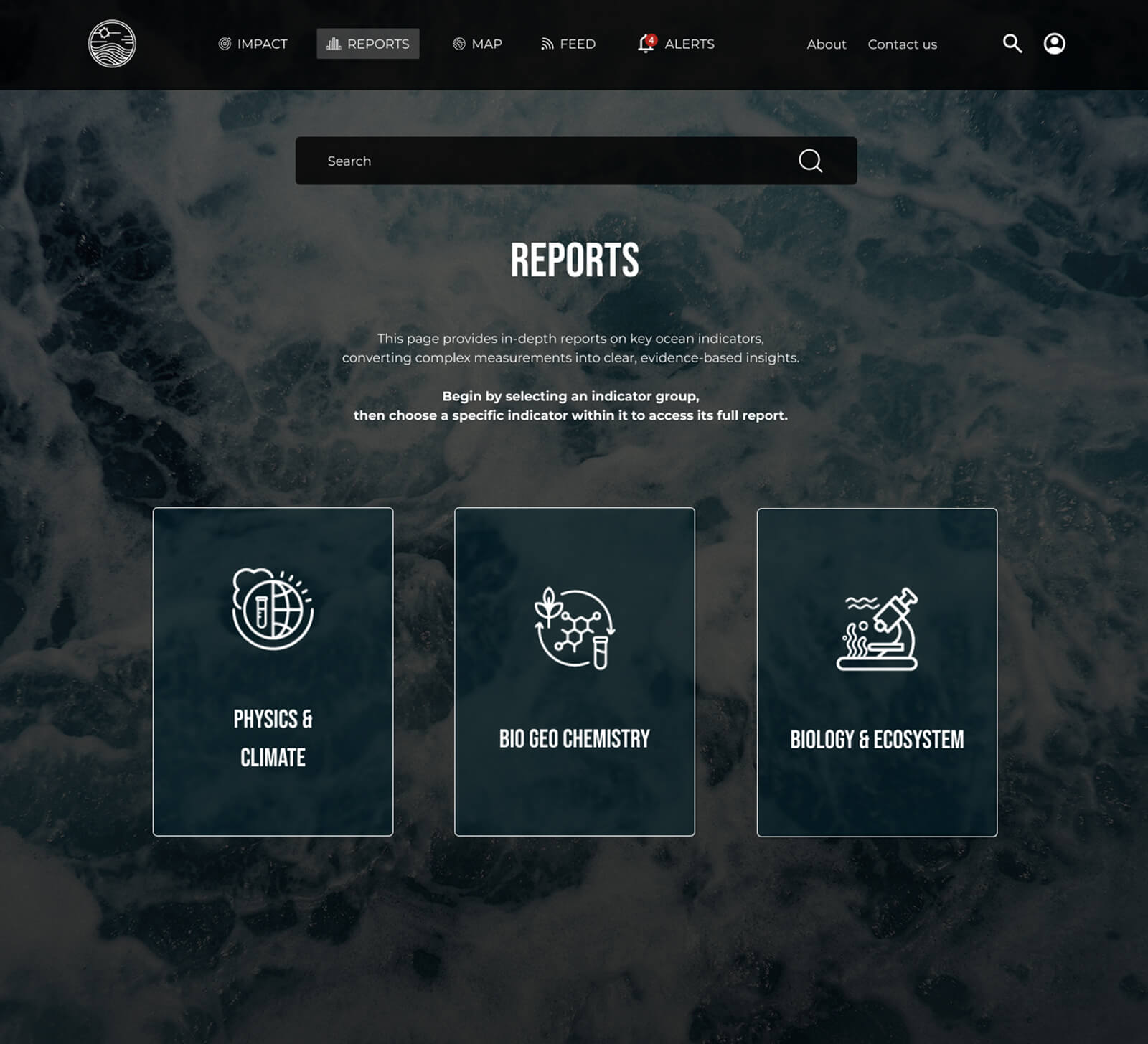
Reports
Map panels
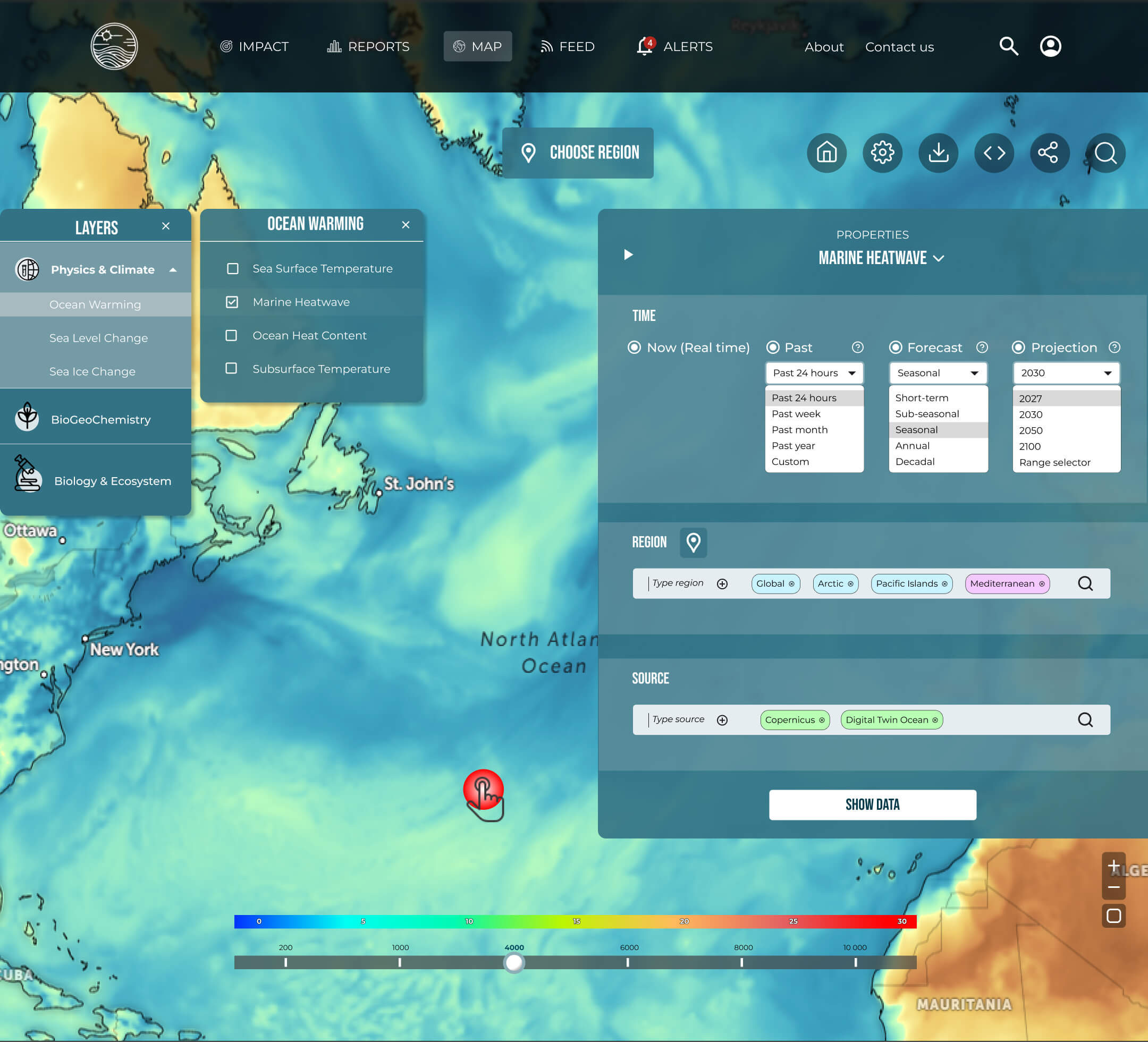
interaction specification
Landing
Overview
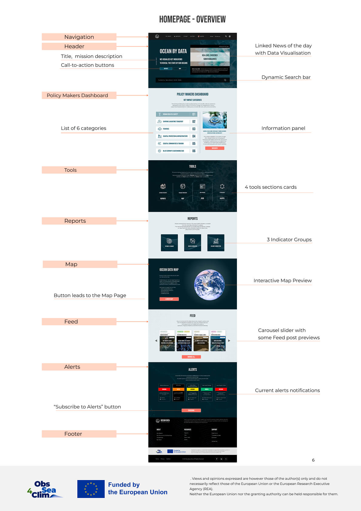
Structure
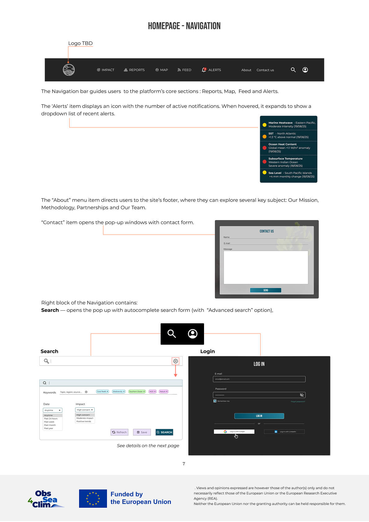
Mobile
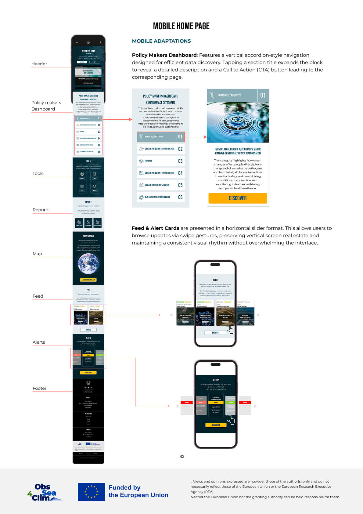
Human impact and Reports
Impact structure
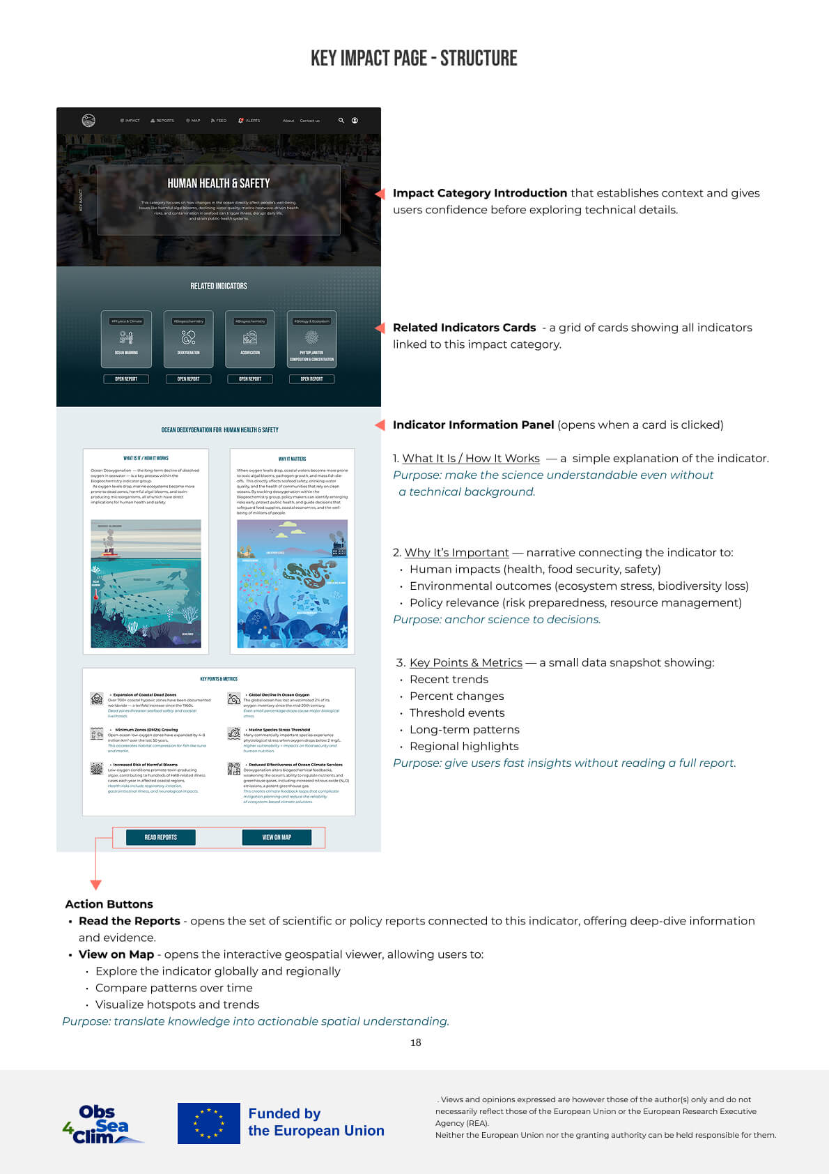
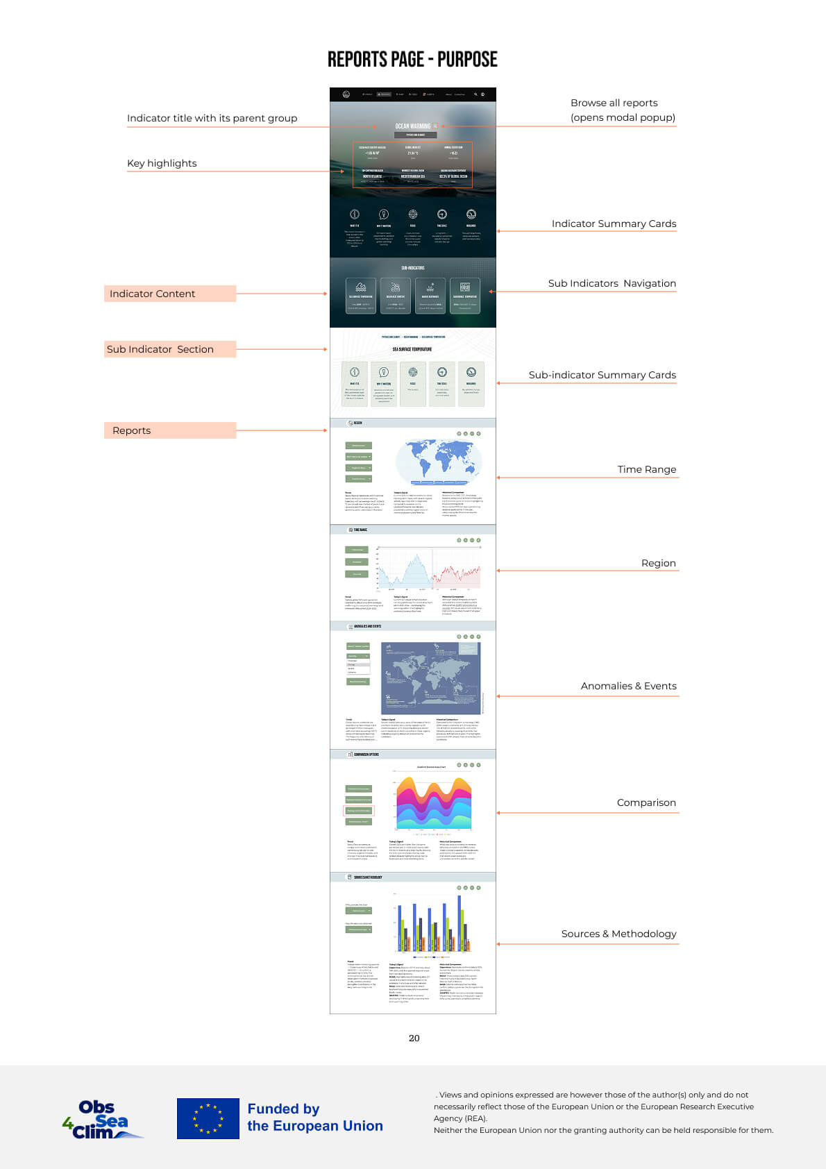
Reports structure
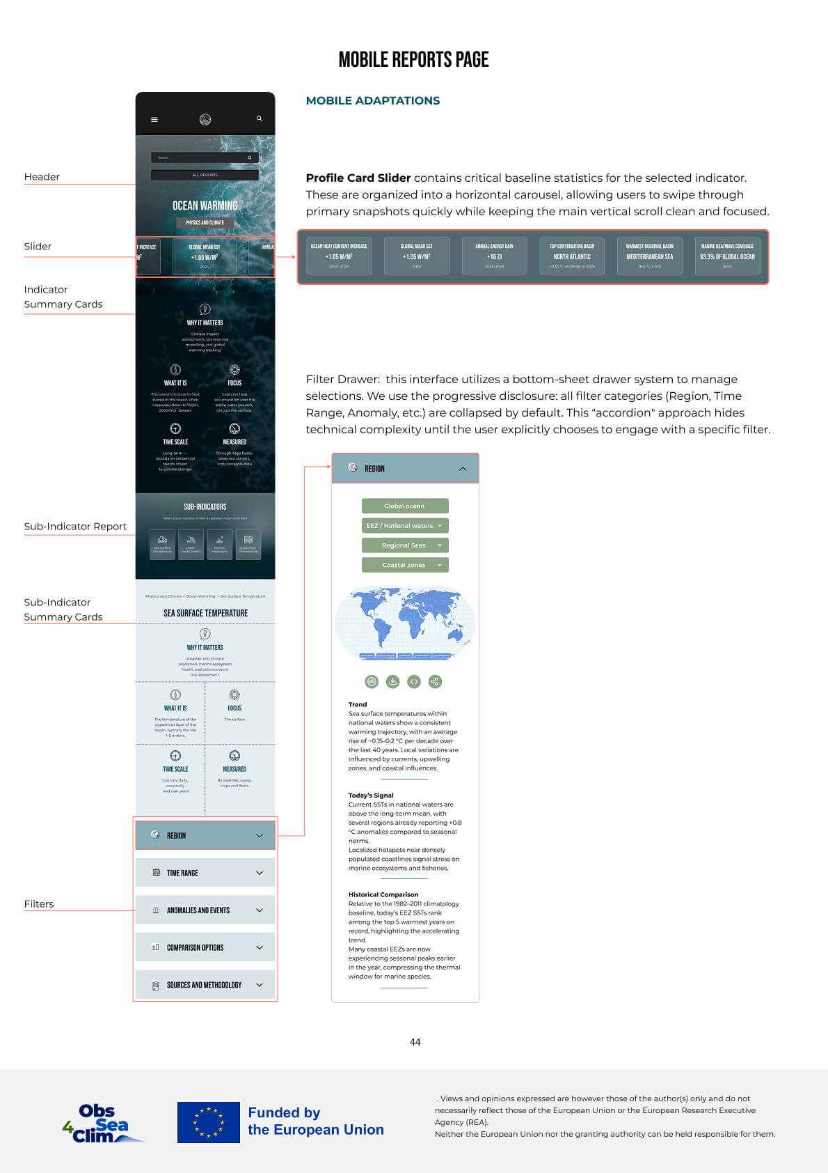
Reports mobile
Map
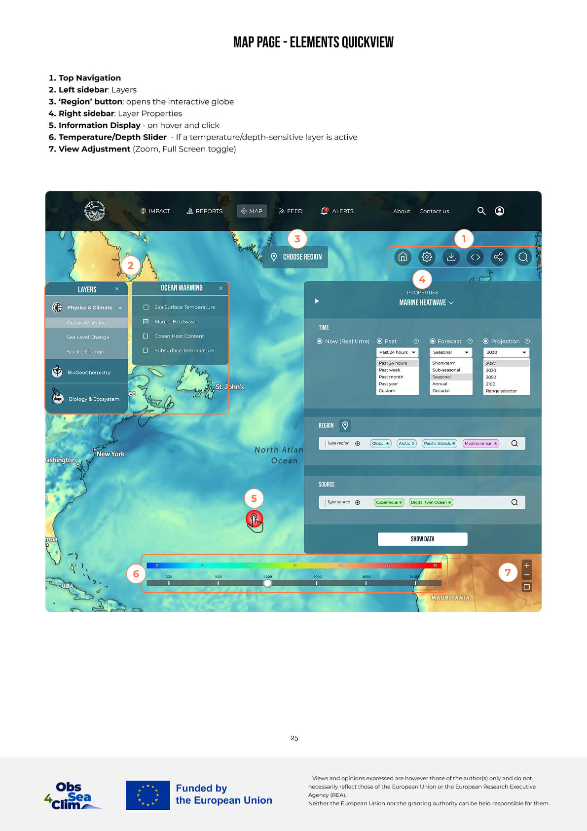
Map elements
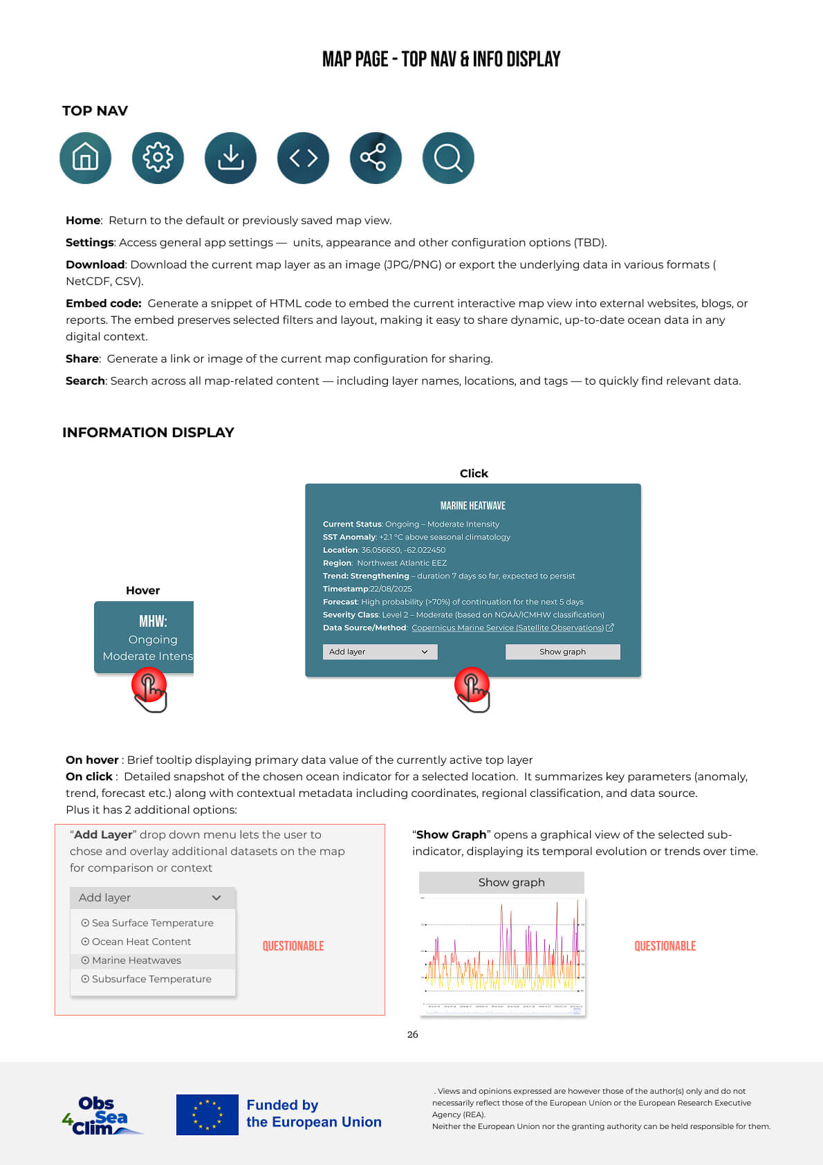
Map displays
Map mobile
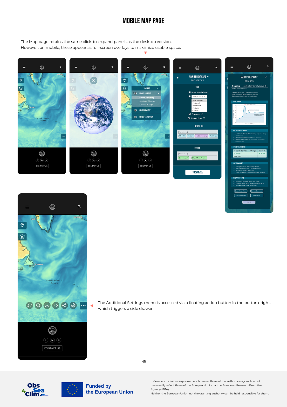
Mobile
A quick note on the mobile version: this is not an app. Not yet at least. The platform is web-first — usually nobody maps ocean data on a phone. But you might still need to check a number, scan a trend, or get a quick sense of what's happening. So I designed a fully functional mobile web interface. If our platform ever becomes a standalone app — well, that foundation is already there.
Map elements
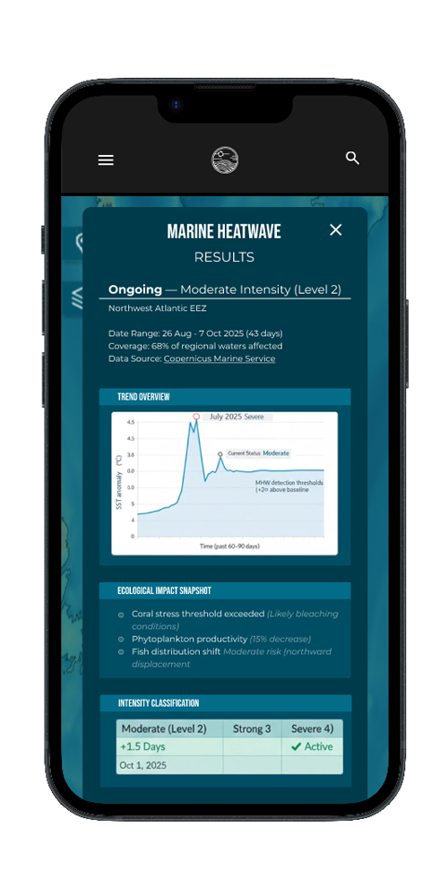
Indicator report
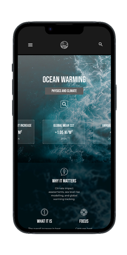
Prototype
IMPACT
Before this platform, ocean data lived in silos. Each source had its own interface, its own logic, its own definition of what an indicator meant. Policy advisors spent days navigating between platforms, unsure which numbers to trust. The data was there — but the signal was buried under fragmentation.
This platform changes that. It keeps the familiar structure of menus and filters that analysts already know, but adds a natural-language layer that translates messy questions into precise queries. The LLM pulls from verified sources and returns structured answers — with maps, charts, and a clear line from data to decision. Because when you're deciding on fishing quotas or marine protected areas, you don't need more data. You need understanding. In time.
Now platform transforms how ocean data is accessed, interpreted, and acted upon.
How we got these numbers
Honest confession — we don't have a year of production data yet. The platform is still being tested with the first clients. So these numbers are more "directional" than "final". But here's how we came up with them:
- We timed the same tasks on 5 existing platforms (Copernicus, EMODnet, NOAA...). Then timed our prototype. The difference was striking.
- We watched 12 people — policy advisors, analysts, scientists — using both the old way and the new way, and measured the difference in their experience.
- We counted clicks and minutes from question to actionable answer.
What we measured
- Speed. From "I have a question" to "here's your answer".
- Platforms. How many websites do you need to visit? Used to be 5. Now it's 1.
- Trust. "Do you believe this?" — the new platform scored way higher. You can actually see where the data came from.
- Reports. Before: "come back tomorrow". After: "here you go, anything else?"
ⓘ The platform is currently being piloted with real clients. Full-scale measurement is planned for late 2026. But for now — this is what we've got, and it's pretty encouraging.
Approximate Metrics — based on preliminary testing
01
Data Accessibility
Unified 12+ ocean data sources into a single platform. Non-experts can now explore complex datasets without training.
— 70% faster
02
Decision-Making Speed
Policy makers can generate reports and insights in minutes instead of days. Real-time alerts enable proactive action.
— 3x faster
03
Policy Action
Surfacing critical environmental issues enables evidence-based policy action. Transparent data builds trust.
— 100% traceable
04
User Adoption
Intuitive LLM-powered interface eliminates the learning curve. Users can ask questions in plain language and get answers.
— 80% without training
By combining layered information architecture with an LLM-assisted interface, the platform enables policy makers to access, interpret, and act on ocean data — without requiring scientific training.
"Before this platform, assessing the impact of marine heatwaves on North Atlantic fisheries required compiling data from 6 separate sources. With this system, we generated a complete regional vulnerability assessment in 3 hours — a process that previously took several days."
— Marine Policy Advisor for Maritime Affairs